at Atlantic Design Center ~ A Bi-Monthly Newsletter
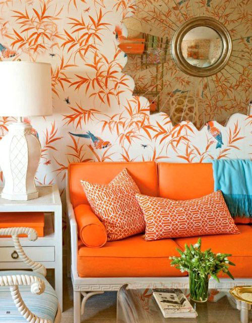
You have waited and waited and waited…and finally you hear, “Yes, it’s a go!” You’ve been watching HGTV and buying magazines for months now. Yeah! You revel in the prospect of starting in to your dream project. So many great ideas! But wait, slowly that feeling of trepidation creeps in. Suddenly it does not seem so easy to commit. We all want something new and hot but it must have staying power. Violets, orange, aquas, citrus…It all looks so right…for other people’s homes. So how do you know that what you pick will not turn out to be the “avocado” of yesteryear?
Recently I attended the “Coverings” Expo in Florida and was fortunate enough to catch the key speaker Leatrice Eisenhart. Her featured topic, “Future Color Trends: Fantasies and Realities” provided many answers to these typical questions. Leatrice is a consultant who has been studying color and trends for years and has written widely on the subject. Which color is the right one to choose? You know if you ask ten individuals you would be lucky to come up with less than ten different answers.
What we do know is that color is the element that we notice immediately. Color sets the tone of the space and can have a positive or negative effect. One tip I can pass along is to study not only home and interior magazines, but to search even wider for future trends. Look to the fashion industry, the automobile industry, the cosmetic industry, the movie industry. They are all on the cutting edge when selecting colors for the season. Manufacturers use color in both product and marketing materials to “coax or cajole, to soothe or astonish us, to renew or replenish” us.
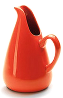
During the Second World War, as women took to working in factories, the one luxury they permitted themselves was to buy a hot new lipstick. Color motivates us, makes us feel good. Today the modern equivalent would be to look at nail polish. For the rst time, sales of nail polish outstrips that of lipstick.You will see a wide palette of both hot neons and metallics in burnished gold and silver at any cosmetics counter along with traditional classic pinks and reds. Right now the 2012 color to watch for is “Tangerine Tango”! Lime greens, aqua, oranges are still huge in “pop” culture. Gentile violets, purples and classic claret are all being used in movie sets such as Downton Abbey and others. These trends in other industries definitely cross over into home furnishings and residential products.
But besides industry and commerce, just turn to nature. There was a time when mixing more than one shade of green in your home was considered a “no, no” but neutral colors are widely loved in nature. The catch word is that green is “sustainable” and has been shown to promote feelings of good health, helping one to breathe slowly and feel better. Green can be mixed with green. Look outdoors! Mother-nature does it all the time.
Remember, satisfy your soul.
Don’t shy away. Commit to your colors and enjoy them!
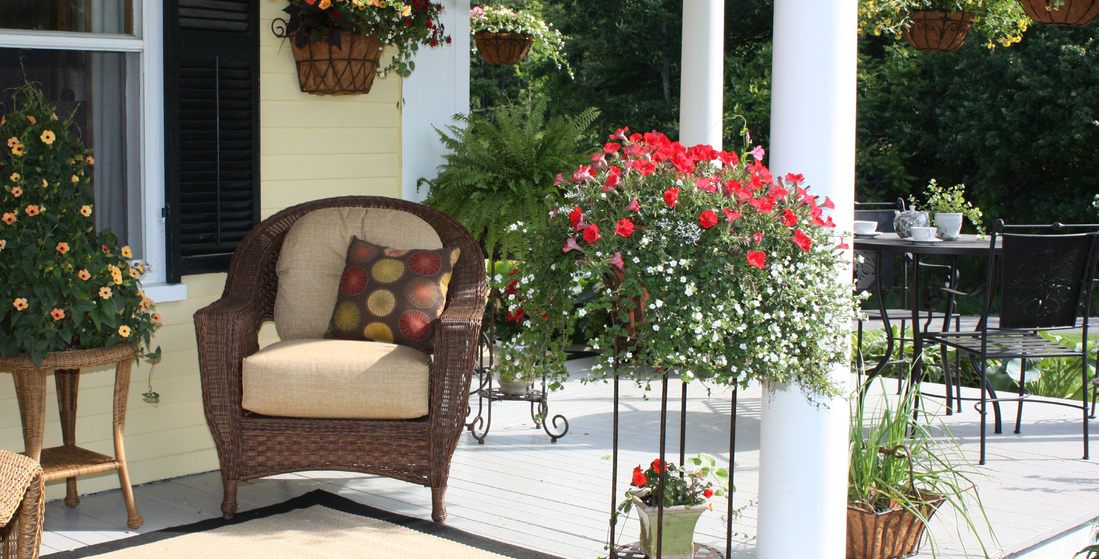
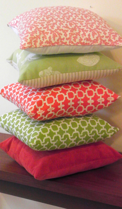
Another way to express yourself with color would be to create a base of neutrals, including greens (yes, green is considered a neutral) and create the “magic” by injecting a punch of color. Accessories, such as pillows, drapes, rugs, artwork, can add contrast and excitement without overwhelming the senses. These accents do not have to be perfectly matched, but must be repeated at least twice or more in the space in order to create a cohesive and valanced environment. That way, if your taste changes over time, you can easily make inexpensive changes and still remain current with color.
So whether you choose to use neutrals or draw from multi ethnic themes, Southwest or preppy old school color combinations, with a well balanced palette, any of these can look good in your home. For more on specific color combinations, you can go to ColorExpert where Leatrice has information and links to her Pantone View color palettes.
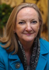
Mary is our consultant specializing in bathroom design. Irish born, she holds honors degrees in both Hotel Mgt. & PR. Years living in Switzerland and the UK fueled her interest in hotel architecture, planning and design. Exposure to both contemporary & classic resorts and properties are reflected in her European sense of style. Her love of art & architecture brought her to Endicott College in Beverly, MA where she pursued her career in Interior Design. She has extensive residential experience working in soft furnishings, drapes & wall coverings, in addition to the bath and tile design she did in Boston and Acton, MA. Mary is now settled in York, Maine with her husband & children. She enjoys sewing & gardening and “dabbles in paint.” Combining her passion for art & color with the skills of drafting & interior design, Mary creates lasting impressions for her clients in tile and stone.
Save this Article
Was this newsletter helpful? You can save or print a copy here.
